HEY 👋 I'M TESSA
I enjoy working on ambiguous design problems.
The weirder, the better.
After years of working across product design, UX/UI, graphic design, and research science, I'm focusing on what I do best as a Functional Product Designer: working with teams to create unique frameworks that help solve problems.

IA + Navigation Refactor
Overview
A comprehensive information architecture redesign focusing on optimizing user navigation flows and content hierarchy.
Process
User research, information architecture analysis, data analysis, concept framework development, and iterative design testing to validate navigation improvements.
Responsibilities
- Concept + Strategy
- Information Architecture
User action spectrum
This Zones + Actions framework organizes our product into focused areas for specific activities. Key actions get one-click access, related actions are grouped logically, and a clear hierarchy helps users stay focused. This current assessment of our product helps us propose streamlined improvements for future IA work.
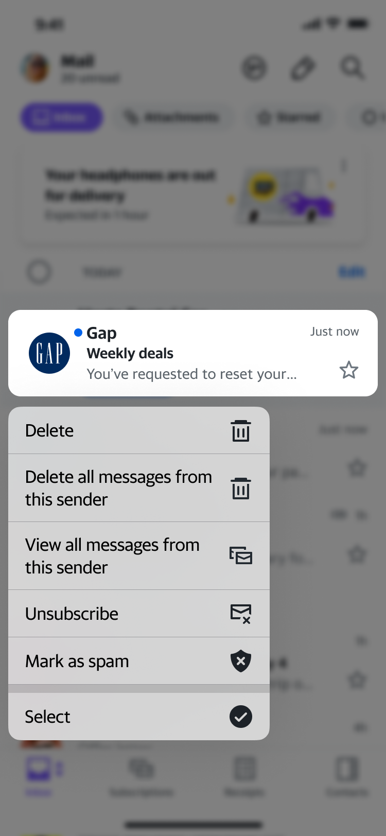
Bulk delete emails by sender
A quick way for users to triage emails from senders in bulk resulted in increased deleted messages and is projected to increase retention over time.
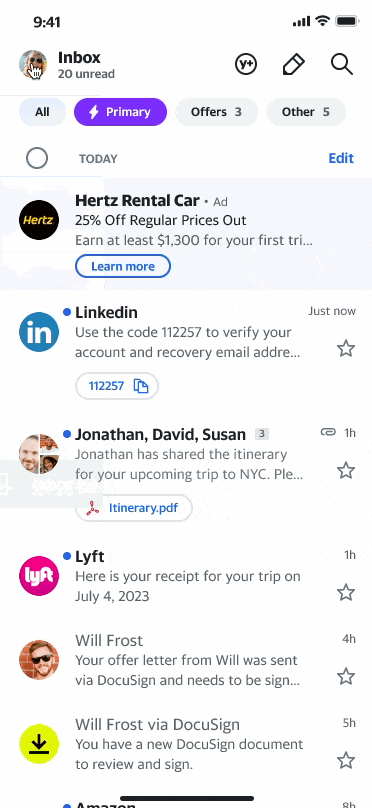
Simpler mobile navigation
Streamlining mobile navigation patterns to reduce cognitive load and improve task completion rates across key user flows beat baseline expectation of +1% page views.

Refreshed mobile graphical ads
Redesigning our graphic mobile ads to reduce ad blindness increased revenue overall for 2023 and beat expectations of $20M/year.

Search vs. Surface
UX Strategy
Exploring a holistic tactic to provide information to users. Standalone surfaces are great for hunt and peck method, whereas other tasks may be better suited as a search flow.

Dynamic scaling tutorial
Team tutorial
I created an interactive Figma-like playground tutorial for team accessibility training, elevating our design team's awareness and capabilities.

Empty state

Long process dialog

Theme selector

Floating action button
Latest Insights + Talks
Sharing knowledge and insights from design practice, research, and industry experience.
Loading latest videos...
Writing + Research
Exploring VR design, development, and the intersection of technology and user experience.
Making Sense of Skyboxes in VR Design
Exploring the fundamentals of skybox design in virtual reality environments and their impact on user immersion.
Read more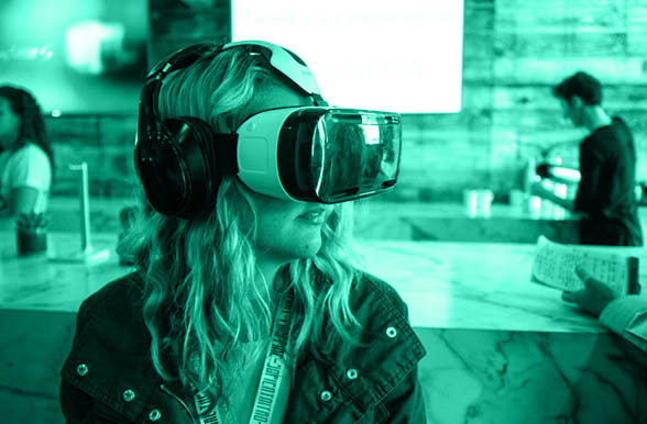
Building a VR App in 14 Days
A deep dive into rapid VR prototyping, from concept to deployment using Unity and modern development practices.
Read more
Python ML Agents in Unity VR
Integrating machine learning agents with Unity for intelligent VR experiences and adaptive user interactions.
Read moreAbout

Hi, I'm Tessa
I'm a Principal Product Designer. I focus on creating frameworks and systems that help teams solve complex design problems. My work spans information architecture, user experience strategy, and design systems.
What I do
- •Design strategy and information architecture for complex products
- •Create frameworks that help teams make better design decisions
- •Research and validate design concepts through experimentation
- •Mentor designers and advocate for user-centered design practices
Background
I have a diverse background spanning product design, UX/UI, graphic design, and research science. This multidisciplinary approach helps me tackle ambiguous problems from multiple angles and create holistic solutions.
When I'm not designing, you can find me tinkering with vibe coding, writing about design or music, or visting local coffee shops looking for the best atmosphere.
Let's work together
I'm always interested in discussing design challenges, collaboration opportunities, or just connecting with fellow designers and researchers.
© 2024 Tessa Chung. Designed and built with care.