IA / Navigation
Yahoo Mail
Redesigning the information architecture and navigation system for Yahoo Mail to improve user flow and email management efficiency
Focus
Information architecture, Navigation, UX Strategy
Role
Lead Designer
Team
Design, User Research, PM, Engineering, Data Science
Timeline
2024 - current
Status
In progress (Phase 1 mobile discovery & concept validation complete)
Company
Yahoo
Overview
A comprehensive redesign of Yahoo Mail's information architecture to reduce cognitive load, streamline user flows, and improve email management efficiency for our core user base of busy millennial parents.
Strategy
Understanding the why behind our approach to redesigning Yahoo Mail's information architecture
Why did we do this? Why now?
Three main reasons:
User needs
They have been telling us over and over that they crave a simple interface, both in user research and in their actions. Users consistently express frustration with complexity and desire streamlined experiences.
Business needs
Retention. We need users to be happy with the product and keep them coming back. Yes, we also need page views and ad impressions and engagement, but ultimately what keeps users coming back? A product that fulfills their needs.
Scalability
Simplifying the product is an investment in our system and engineering. With streamlining, there is less to maintain, less to break. This creates long-term sustainability for our development processes.
Finding opportunities
"Any one of these alone only gives us part of the picture. However, when we look at them together, we can identify gaps where users may have unmet needs. That's where opportunities lie."

Collecting Information
Data + Engagement
There are key areas within the app and on desktop product where users aren't engaging. This is using up space in our product and could easily be contributing to overwhelm or cognitive load.
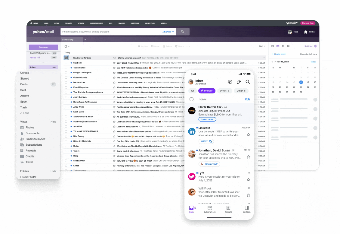
Desktop rails
Right Rail:
- •Calendar, Notepad, Contacts
Left Rail:
- •Photos, Documents, Receipts, etc.
Native mobile bottom bar (except Inbox)
- •Subscriptions
- •Receipts
- •Contacts
User Research
Together with our UX researchers, we pulled research insights from past studies to understand what themes emerged. We found gaps in our foundational research, so our UX researchers conducted additional studies to understand what users do when they come to Mail. The #1 job to be done is checking email. People want quick access to what matters most.
Mail tasks center on utility + organization
People are using email for tasks rather than communicating. Email has become a productivity tool for managing daily responsibilities.
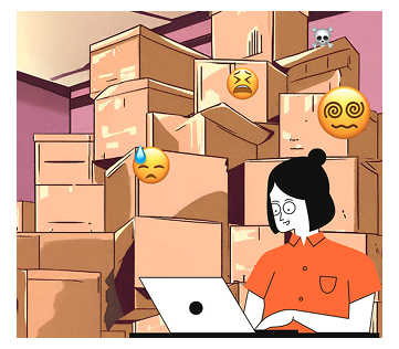
There's too much email information
Too much information may make people feel anxious. Users report feeling overwhelmed by the volume of options and data presented.

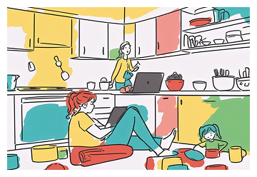
People are busy juggling their lives
They want important content and want to move with speed. Time is precious and efficiency is paramount in their daily workflows.

There can be platform specific use cases
Thoughtful, time intensive tasks are often taken on desktop, quick actions on mobile devices. Context matters for user behavior.
Busy millennial parents are our core users
We found a clear user profile: people juggling a lot who need email to just work efficiently.
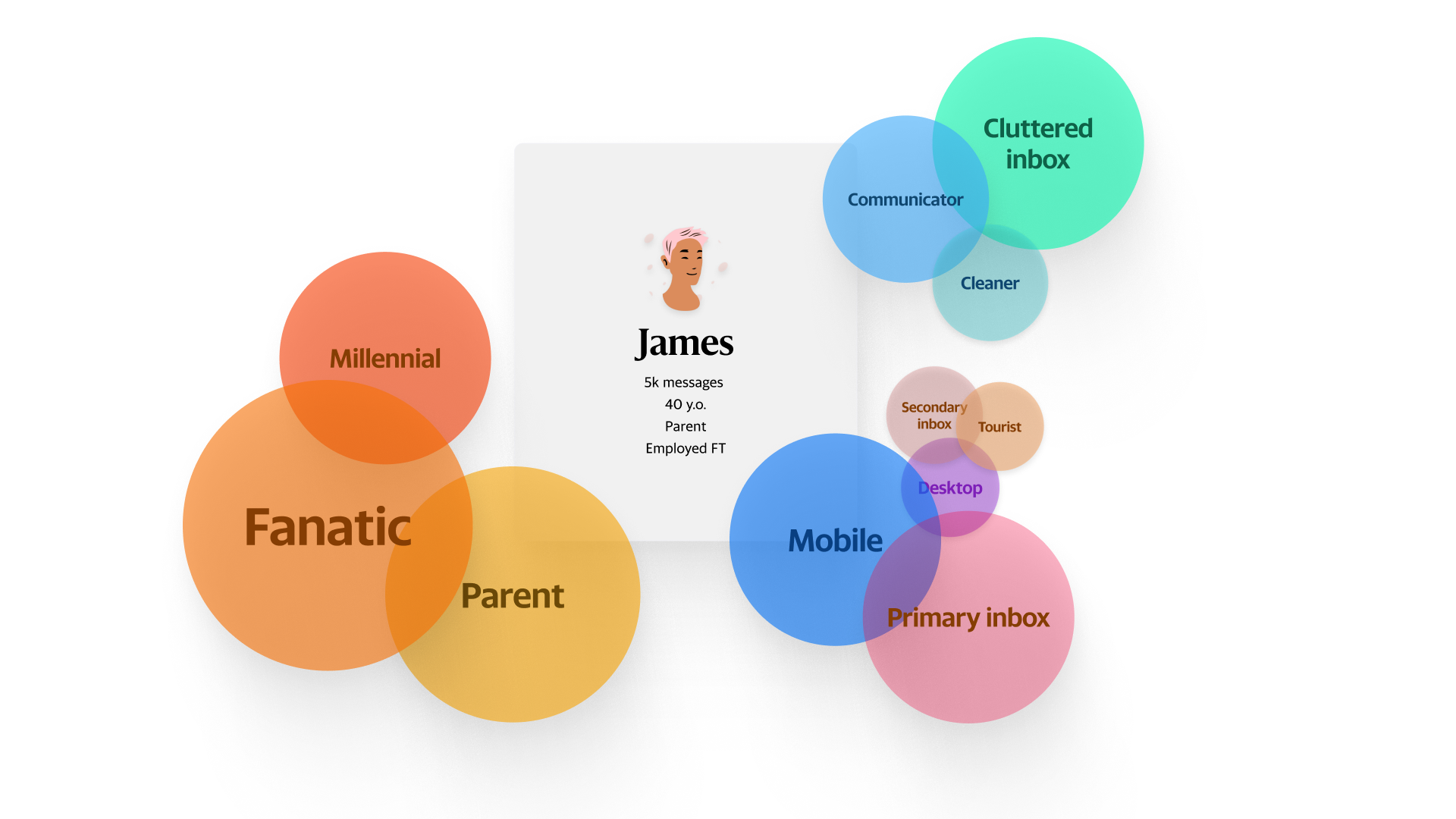
What they're like:
Key Characteristics
YM app is easy to use for standard use cases, but users are largely unaware of additional features.
"It's easy to use for the things that I typically use it for. Checking my emails, keeping up with important documents."
"There are a lot of features that I'm realizing now were not very easily readily seen or available. Unless you really, really dig deep into it."
"It's very cluttered. There's a lot of stuff. ... You have to really look and see. All the things that you think are not there, are there."
Mobile email use is largely habitual and utilitarian. Users are rarely in an exploratory mindset.
"I'm just going right to my inbox. And I'm not thinking about these [other things] ... I'm going: 'Okay. I gotta check my emails.' ... By the time that's over, I don't have time to do all the other fun stuff."
"If I'm able to go through, read my email, and clean it out, I'm getting that done. I'm not necessarily looking for another path."
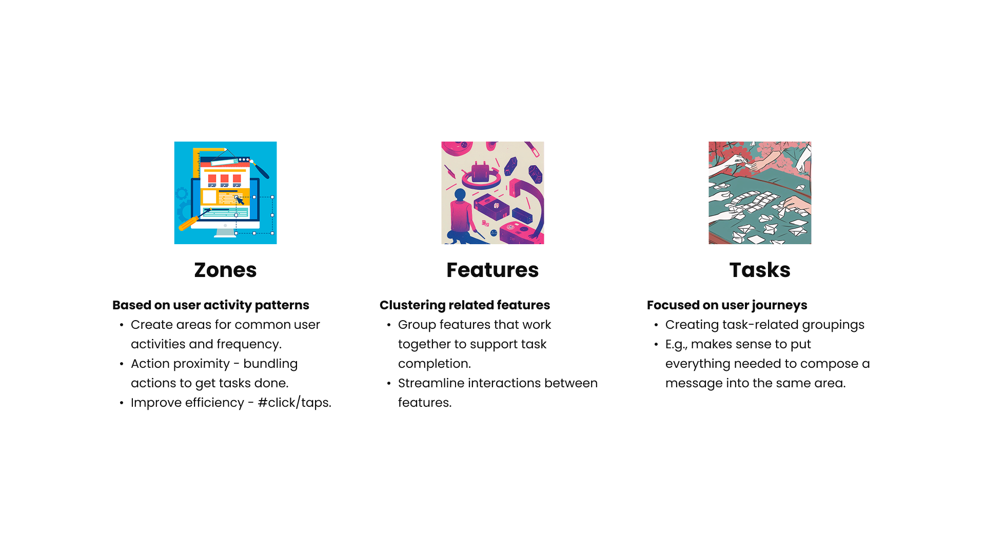
IA Approach
Our systematic methodology for redesigning Yahoo Mail's information architecture
Key Principles
Elevate key utilities with prominence
Make it easy to get important tasks done quickly.
Bubble it up
Don't let users miss out on anything important
A holistic approach
Give users access to most important tasks
Consider sunsetting features and surfaces
Remove anything not serving users.
Reduce + streamline
Cut clutter, redundancies, and cognitive load.
Like goes with like
Group meaningful content together for ease of use.
Bottom up design
Tasks are the fundamental building block of the experience.
User journey map
Based on our research, we identified two primary user modes when interacting with email:
Fight/Flight mode
Checking their inbox on the fly, scanning for important items. Users are in a hurry and need quick access to critical information.
Retrieve/Consume mode
Finding or responding to an email. Users have more time and are focused on specific tasks or detailed interactions.
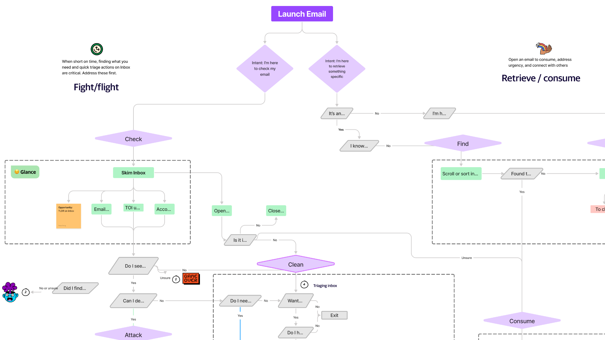
Fight/Flight Characteristics
- Quick scanning and triage
- Immediate action or defer decisions
- Mobile-first interactions
- Time-sensitive responses
Retrieve/Consume Characteristics
- Thoughtful reading and composition
- Detailed email management
- Desktop-preferred for complex tasks
- Organized workflow completion
IA Methods
User Action Spectrum
To assess what users are doing where and how we might make the most common tasks simpler
Loading animation...
High Frequency
Daily actions
- Check inbox
- Read emails
- Delete/Archive
- Quick reply
Medium Frequency
Weekly actions
- Compose new email
- Search emails
- Organize folders
- Forward messages
Low Frequency
Monthly actions
- Settings changes
- Filter creation
- Account management
- Advanced features
IA Planning
Strategic planning and alignment for implementing our information architecture recommendations
Discovery Summary
Takeaways
Our best course of actions - to test simplification
Based on our comprehensive research and analysis, we've identified key opportunities to streamline the user experience through strategic simplification.
The data consistently points toward reducing cognitive load while maintaining functionality that users actually need and use regularly.
Testing these simplified approaches will validate our hypotheses and provide concrete metrics for measuring improvement.
Alignment
Getting everyone on board with a plan to start experimentation
Cross-functional alignment is crucial for successful implementation of our IA recommendations across design, engineering, and product teams.
We need to establish clear success metrics and testing protocols that all stakeholders understand and support.
Creating a phased rollout plan will help manage risk while allowing us to gather meaningful user feedback at each stage.
Implementation Strategy
Phase 1: Validation
Test core assumptions with targeted user research and prototype validation
Phase 2: Pilot
Launch limited rollout to measure impact and gather user feedback
Phase 3: Scale
Full implementation based on validated learnings and optimized user flows
Results & Next Steps
Current progress and future implementation plans
Phase 1 Completed
- ✓Comprehensive user research and data analysis
- ✓Information architecture audit and mapping
- ✓User action spectrum framework development
- ✓Key principles and design guidelines established
Phase 2: Design & Prototype
- →Create new navigation concepts based on research
- →Prototype key user flows and interactions
- →Conduct usability testing with target users
- →Test at scale in experimentation to validate design and guardrails before GA